Logo redesign, Site Map part 1

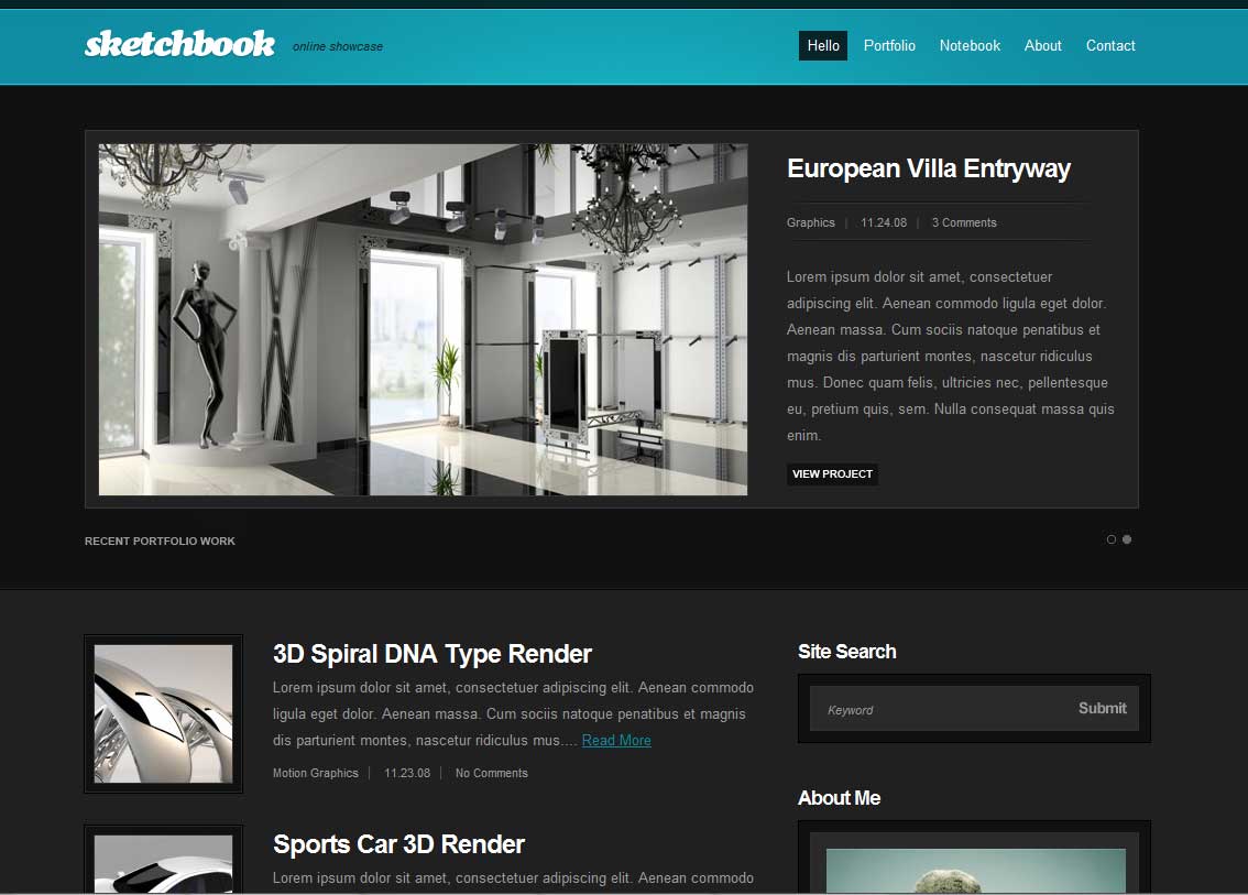
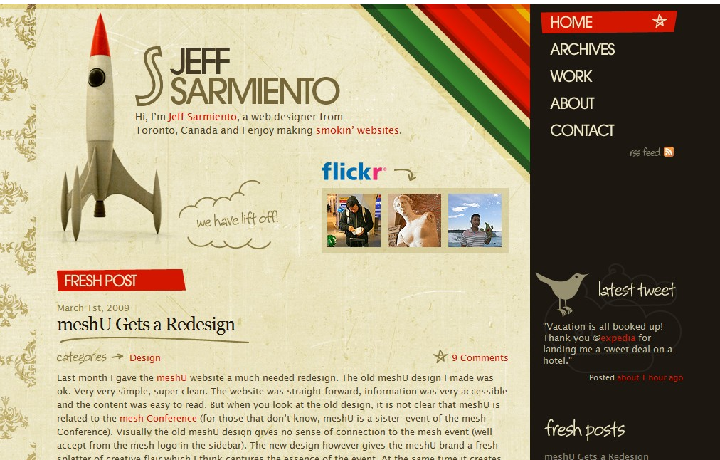
This evening, I still like my color palette, and last night I played around with the logo a bit. Here’s what I think is going to be close to a finished logo: Matula Logo test2

I like the simplicity and typography.  Also, it can be scaled down quite a bit, and the T and M still make it identifiable: Matula Logo Test - small

Next up, I need to figure out exactly what I want on my site.  Here’s a quick list, basically just a brain-dump:

  • Portfolio page
  • Blog
  • About/ Bio
  • Contact page/ form
  • Maybe sub-portfolio pages… one for Web Design, Development, Print work, or whatever
  • An experiment page, where I can post code demos or designs that I’m experimenting with
  • Links, both to stuff I’ve worked on and to pages I like
  • Tutorials/ Tips? Walkthroughs? May just keep that as part of the blog…
  • Pictures/ Photos / Video
  • Podcast? On something?

That’s just off the top of my head.  And some of those probably don’t need their own page, they could live in the sidebar or footer or something.

Something else I need to think about is do I want to just categorize my Posts or use WordPress 3’s new Custom Post Types? As I think about it, it might be easier to use the Custom Types, because I know sometimes I will forget to categorize things the correct way. With a Custom Type, I know that “Experiments” posts will always go to the right place.

Next, I’ll probably start sketching out some layout ideas and get my sitemap nailed down.

Finding a Color Scheme

In the process of redesigning this site, I’m at a point where I’m not sure what I should be focusing on next.  There’s layout, wireframing, a site map, a logo, textures, stock photos, self-created images/ photos, and many many more things.  But after looking at some the sites I was inspired by, I saw a pattern that I really liked:

  • Crisp edges
  • muted, earthy tones
  • some texture
  • interesting typography

For the typography, I like the look of Frutiger LT, and created a simple text logo with that as the base.

Frutiger LT font logo

I tried out some different kerning, and even whether to add a space between “Terry” and “Matula”. The top one I kerned each letter so that it only left about a pixel between each character.  I’m not sure which one I like the best… and I played around with some colors and effects, so I might need to re-examine them later as a solid color.

Speaking of color, I went over to Kuler and checked out some different schemes.  Keeping with some of the colors from the sites I chose, I picked out the “2004” scheme, with  just very slight modifications:

portfolio color scheme

I’m pretty happy with that. Now I need to decide whether I want a dark-on-light or light-on-dark style.  And what do I want to include on the site and where…

Inspiration

Went through some sites with links to interestingly designed site.  Here are a few screenshots I captured.  Without thinking to much about them, I just grabbed ones that simply appealed to me. Next, I’ll try figure out why I like them…

New Site

I figure the first topic I’m going to blog about is the process of updating my site.  First thing, I updated my site to WordPress 3… because WP is just awesome.  My next step is to get a design I like.

I’ve got a couple of things I’m doing now. One, try and find some inspiration, specifically with a self-evident Google search.  I’m also gathering some resources, mostly from this great Smashing Mag post but I also downloaded this 960 Grid to play around with.

For the design, I really want something that reflects who I am.  The problem is, I’m not quite how that will work. Do I do a dark background with light text, minimal design, colors, retro, grunge? Or something else?  A lot of times, I’ll see a site I like and use that as inspiration… but it’s not really me.  It’s just a design I like the look of.